

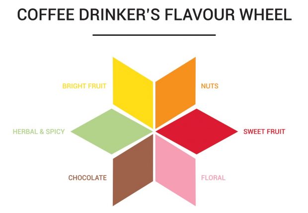
The Coffee Drinker’s Flavour Wheel. Image courtesy of Cuperus.
With the unveiling of the remodel of its flagship café in Antwerp, the longtime Belgian roaster Cuperus has launched a creative new concept that seeks to narrow the gap between professional coffee tasters and casual coffee drinkers who may be overwhelmed by the intricacies so often presented to them by precision-focused authors of specialty coffee flavor notes.
The company has introduced the “Coffee Drinker’s Flavour Wheel,” tying in six color-coded flavor themes with its new packaging and re-imagined portfolio of blends and single-origins. The launch of the consumer-focused wheel coincided with the European premier of the new Coffee Taster’s Flavor wheel, the visually striking, multi-layered cupping tool developed by the Specialty Coffee Association of America that draws from the World Coffee Research Sensory Lexicon. (To be clear, the two wheels are not otherwise affiliated.)
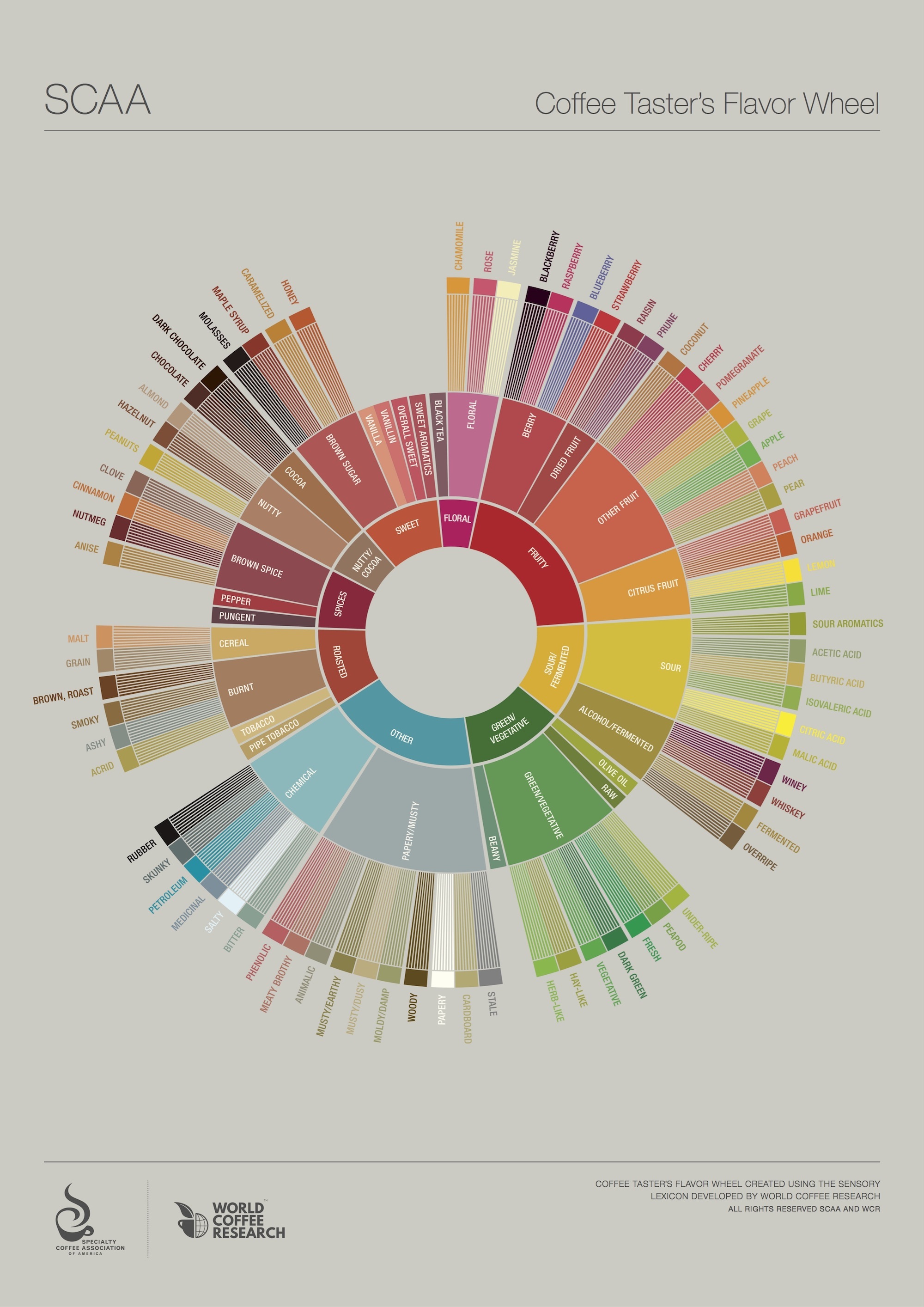
The Coffee Taster’s Flavor Wheel
With 116 identified attributes, the Taster’s wheel would seem to be a confounding prospect to anyone who doesn’t cup coffee professionally, and the SCAA even gives professionals a handy guide on how to use it. By contrast, the Drinker’s Wheel is remarkably simple, offering only six primary attributes: Nuts, Chocolate, Floral, Sweet Fruit, Bright Fruit, and Spices and Herbs.
“Don’t get us wrong, we are a member of World Coffee Research — that is responsible for the Sensory Lexicon that led to the redesign of the new Coffee Taster’s Flavour Wheel — and love this updated way of working. But we needed an easy way of talking to our customers,” Cuperus co-owner Ellen Goormans said in an announcement of the marketing and packaging effort, adding that the company has been seeking ways to “bridge the gap between ‘regular coffee’ and ‘specialty coffee.’”
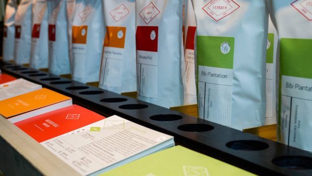
Color-coded Cuperus bags on the shelf
To this end, Cuperus has unveiled bags stickered with one of six colors represented on the wheel. “Basic offerings” are mostly white with a splash of color, blends have more color coverage, and single-origin “specialty coffees” receive the most color coverage of all. The idea, Cuperus says, is to help consumers better understand quality and flavor distinctions between each of its three basic types of offerings, while also allowing them to navigate among the selection at their own pace.
Nick Brown
Nick Brown is the editor of Daily Coffee News by Roast Magazine.


Comment
4 Comments
Comments are closed.

That’s nice to simplify, but I question the placement of the descriptors around the ‘wheel’. Why are nuts and chocolate opposite? Shouldn’t they be next to each other like the taster’s wheel? And I can guarantee the average coffee enthusiast (not just drinker) couldn’t tell you what ‘bright’ fruit is.
I agree with your second point about the lack of clarity in the category labels. I think simplification is great, but yellow red and pink aren’t clearly separated
Very similar to TCHO chocolate’s flavor wheel:
https://en.wikipedia.org/wiki/TCHO#/media/File:TCHO-FlavorWheel.jpg
Sorry, but Over simplification is not a step forward unfortunately.