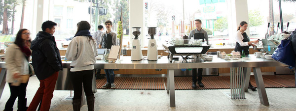
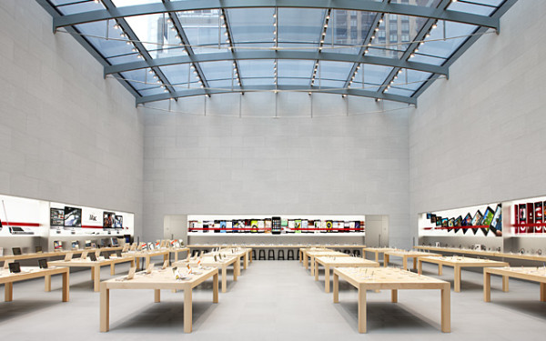
In a recent piece for the Wall Street Journal series The Accelerators, a weekly blog series focused on entrepreneurship, Blue Bottle Coffee owner James Freeman shares some illuminating thoughts on cafe table design.
Specifically, Freeman cites the large wooden display tables at Apple stores, which he says crossed his mind routinely in 2012 as Blue Bottle was in the midst of several retail projects.
I love that these tables hold all the necessary infrastructure – electricity, data, security – without calling attention to it. They look and act like tables, but they are tools, really – effortless, subtle mechanisms for inculcating a desire to interact with an object in the simplest manner possible.
(Incidentally, Blue Bottle and Apple have a lot more in common than table design, according to a piece published by Slate yesterday.)
Freeman says the recently opened W.C. Morse building Blue Bottle location — the company’s largest retail outpost to date — allowed him and local firm Jensen Architects to help redefine the Apple table concept within the coffee shop environment. For anyone remotely interested in cafe design, the full piece is worth a read. Here is an excerpt:
The table was designed to look like a stainless steel workbench with trestle legs – a familiar-seeming object. But inside its very solid-looking body is a matrix of electrical conduits, water lines, data lines, and serious amounts of electricity. We inset everything we could into the table top, as well: pitcher rinsers, chilled bain maries for milk, two marble slabs that I hoped would subtly signal to guests where their drinks had arrived.
Nick Brown
Nick Brown is the editor of Daily Coffee News by Roast Magazine.


Comment