Welcome to Design Details, an ongoing editorial feature in Daily Coffee News focused on individual examples of coffee shop architecture, interior design, packaging design or branding. If you are a coffee shop owner, designer or architect and would like to submit your project for consideration, reach our editors here.
Design Details: French Kitsch III
- Project: French Kitsch III
- Client/Owner: Chanon Jeimsakultip, Anuchit Vongjon
- Location: Mueang Nakhon Ratchasima District, Thailand
- Size (building): 360 square meters
- Opened: 2023
- Design firm: Touch Architect (Nonthaburi Province, Thailand)
- Photographs: Metipat Prommomate, Anan Naruphantawa
For the third location of the French-style patisserie and cafe French Kitsch in Northern Thailand, the firm Torch Architect leaned into the name with numerous historic and modern cultural touches.
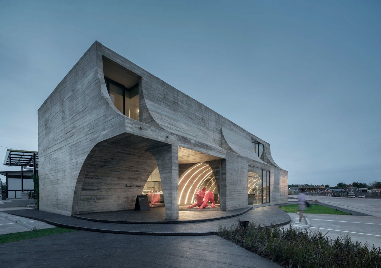
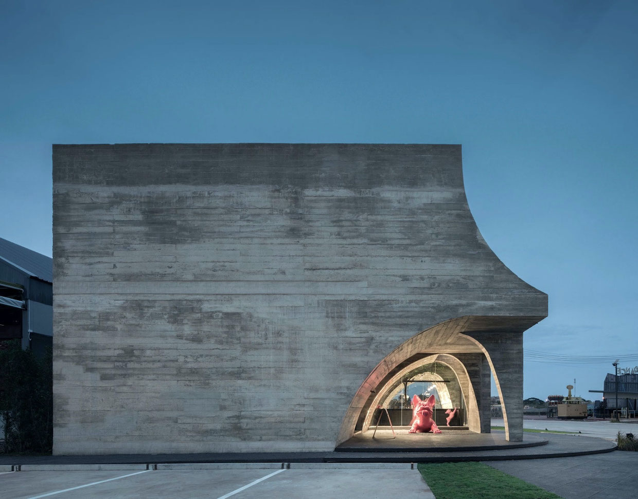
The owners’ French bulldog plays prominently in the brand design, while the building itself references the imperfect shape of a croissant.
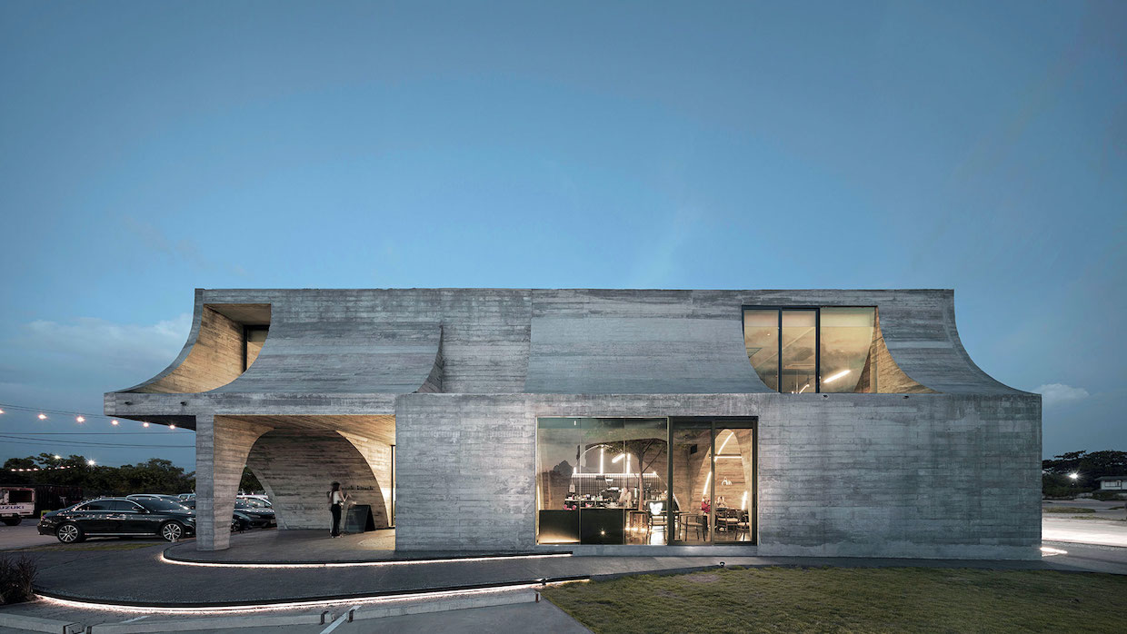
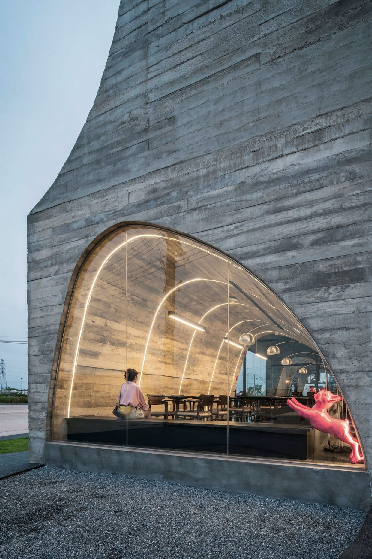
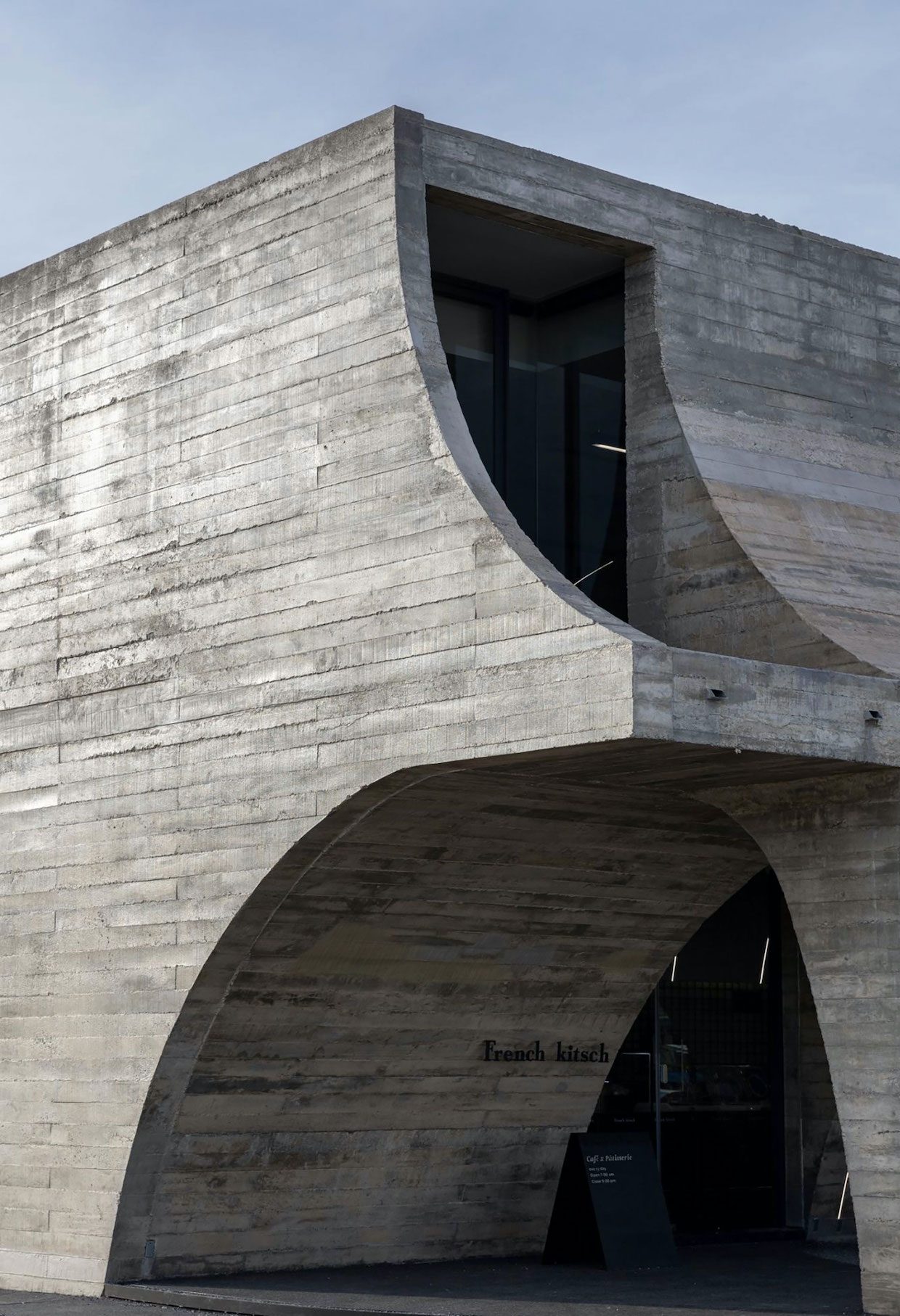
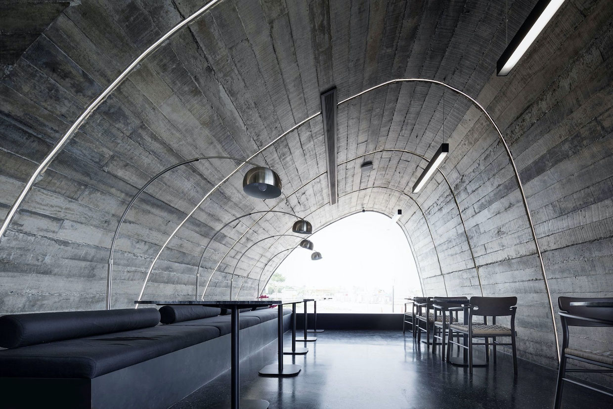
The design also references French cathedral architecture, yet with rhythmic arches of different scales created in place of perfectly symmetrical arches. The design started with a perfect rectangular mass that was made imperfect by carving out imperfect arches on the first level and inverted imperfect arches on the second level.
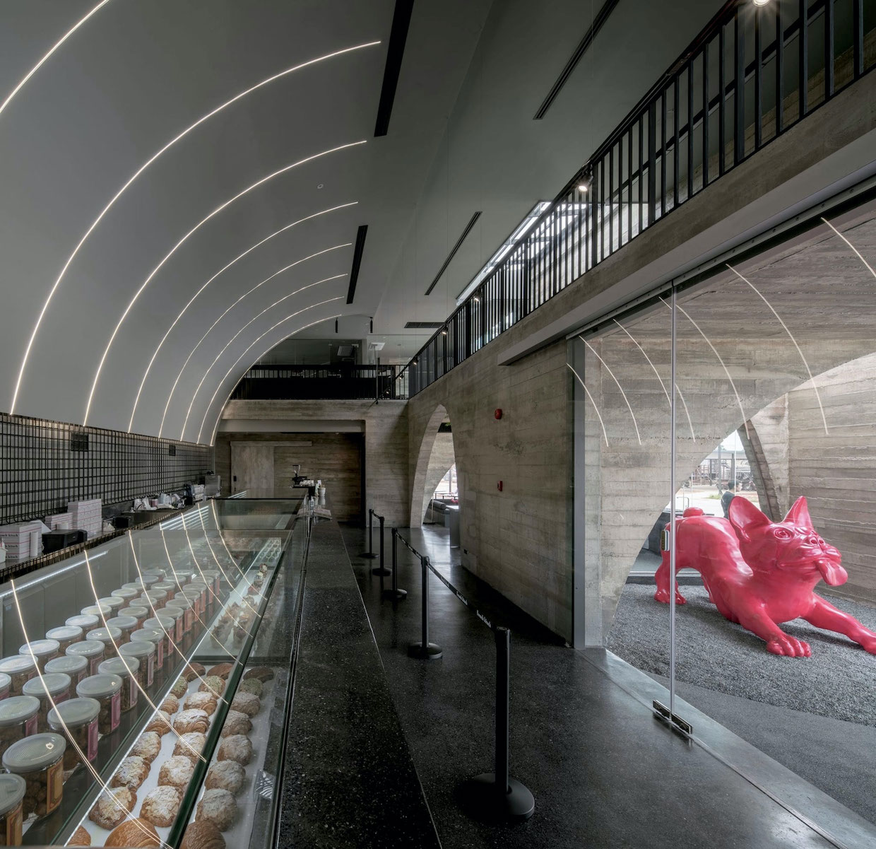
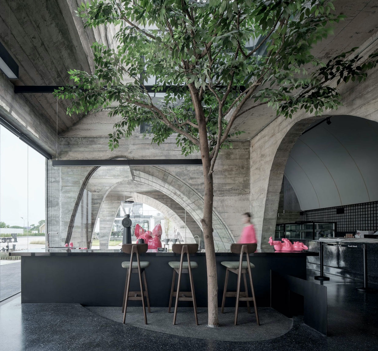
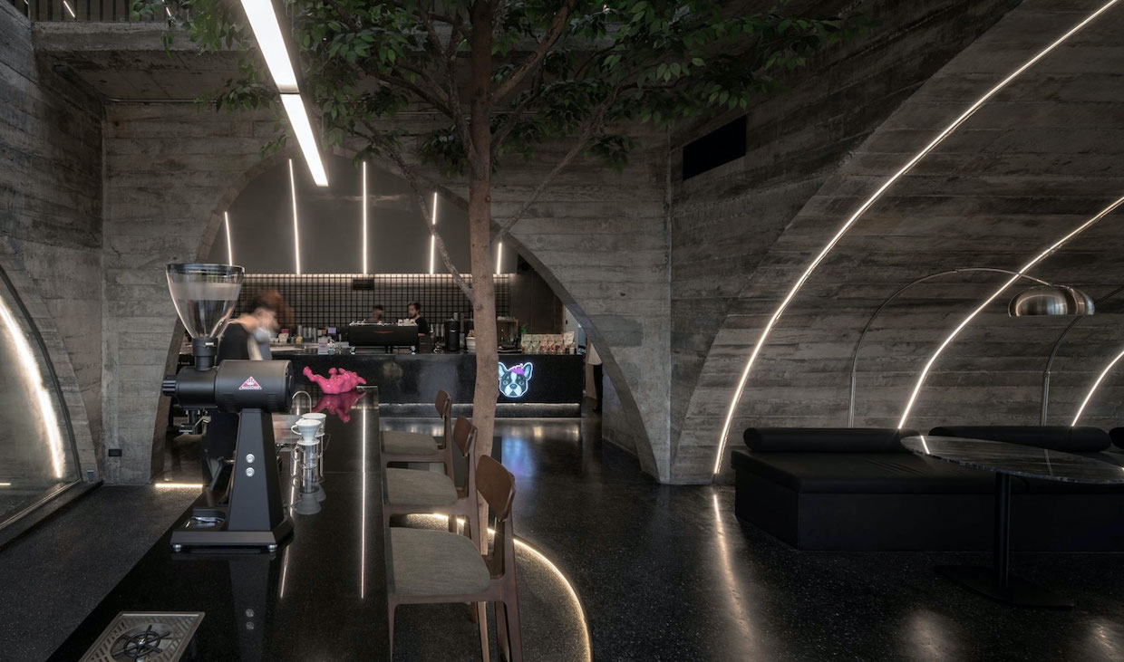
“On the first floor, these arches embrace visitors with their antique yet modern looks, creating shadow along the path and when light passes through the arched window, it creates reflection on the floor, similar to that of cathedral glass,” Touch Architect said in a project description shared with Daily Coffee News. “The oversized imperfect arch also creates a continuous space from the counter to the second floor, highlighting the full-function counter, allowing it to be seen from both floors.
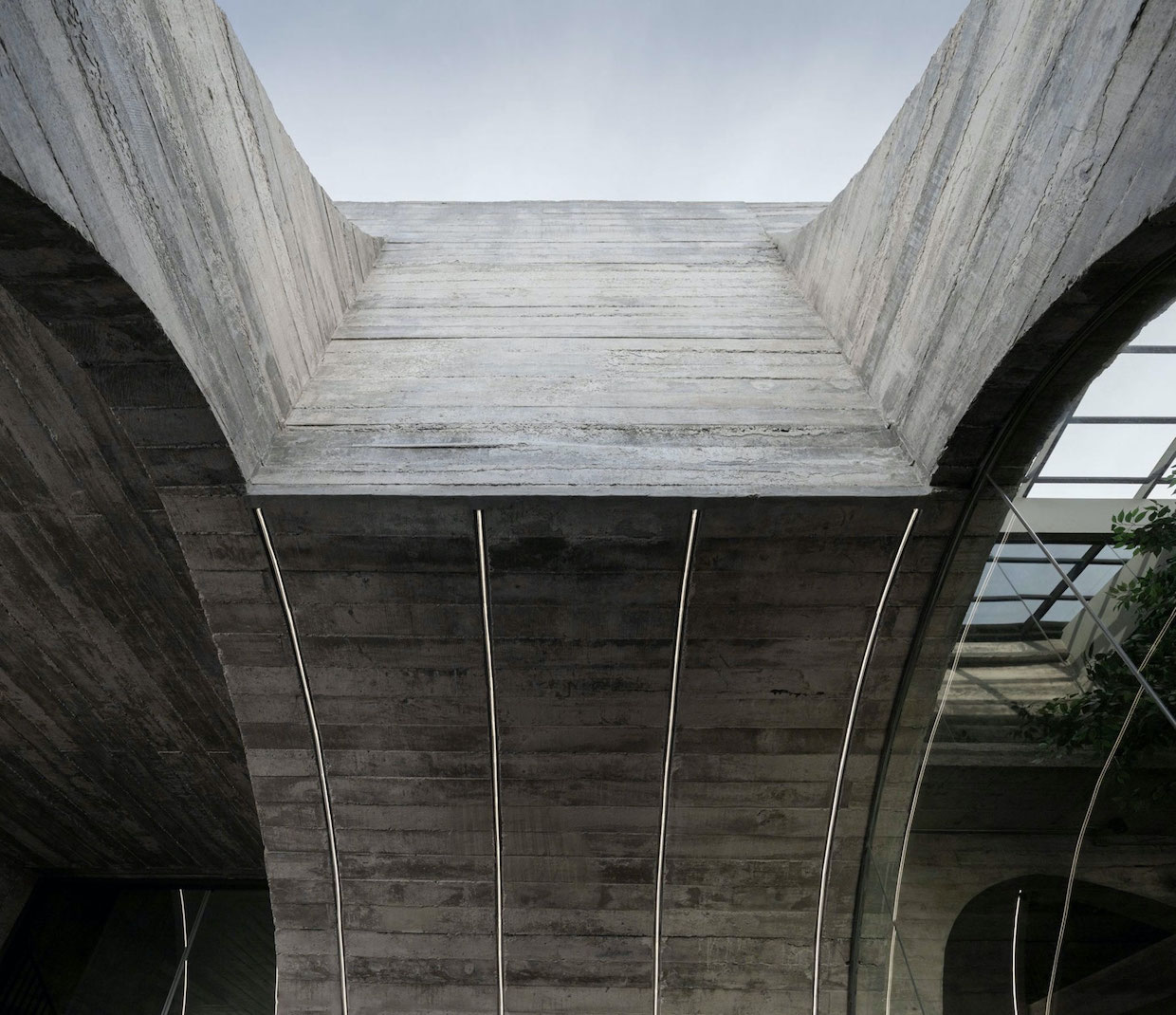
On the second floor, voids are carved into the inverted curves, allowing sunlight to enter what are predominantly shaded areas.
Touch said it chose textured concrete to strengthen the concepts of perfection and imperfection, “where the wall is not completely smooth, but it reflects the authenticity of the material which can be beautiful by itself.”
“Moreover, by using concrete as the main material, the furniture, decorations, and LED lights are made outstanding, emphasizing the imperfect arch curves within the tunnel space, creating a strong memorable image of the cafe,” the firm stated.




Comment