Welcome to Design Details, an ongoing editorial feature in Daily Coffee News focused on individual examples of coffee shop architecture, interior design, packaging design or branding. If you are a coffee shop owner, designer or architect and would like to submit your project for consideration, reach our editors here.

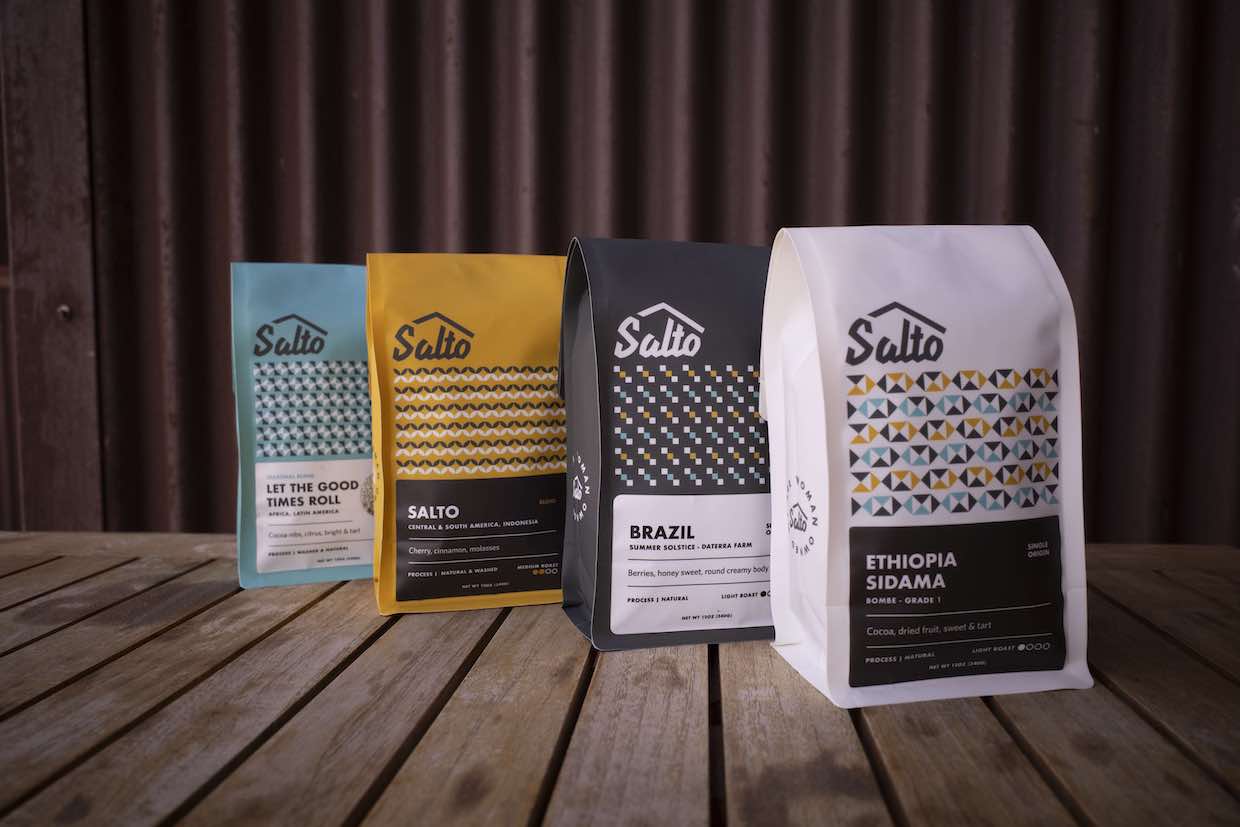
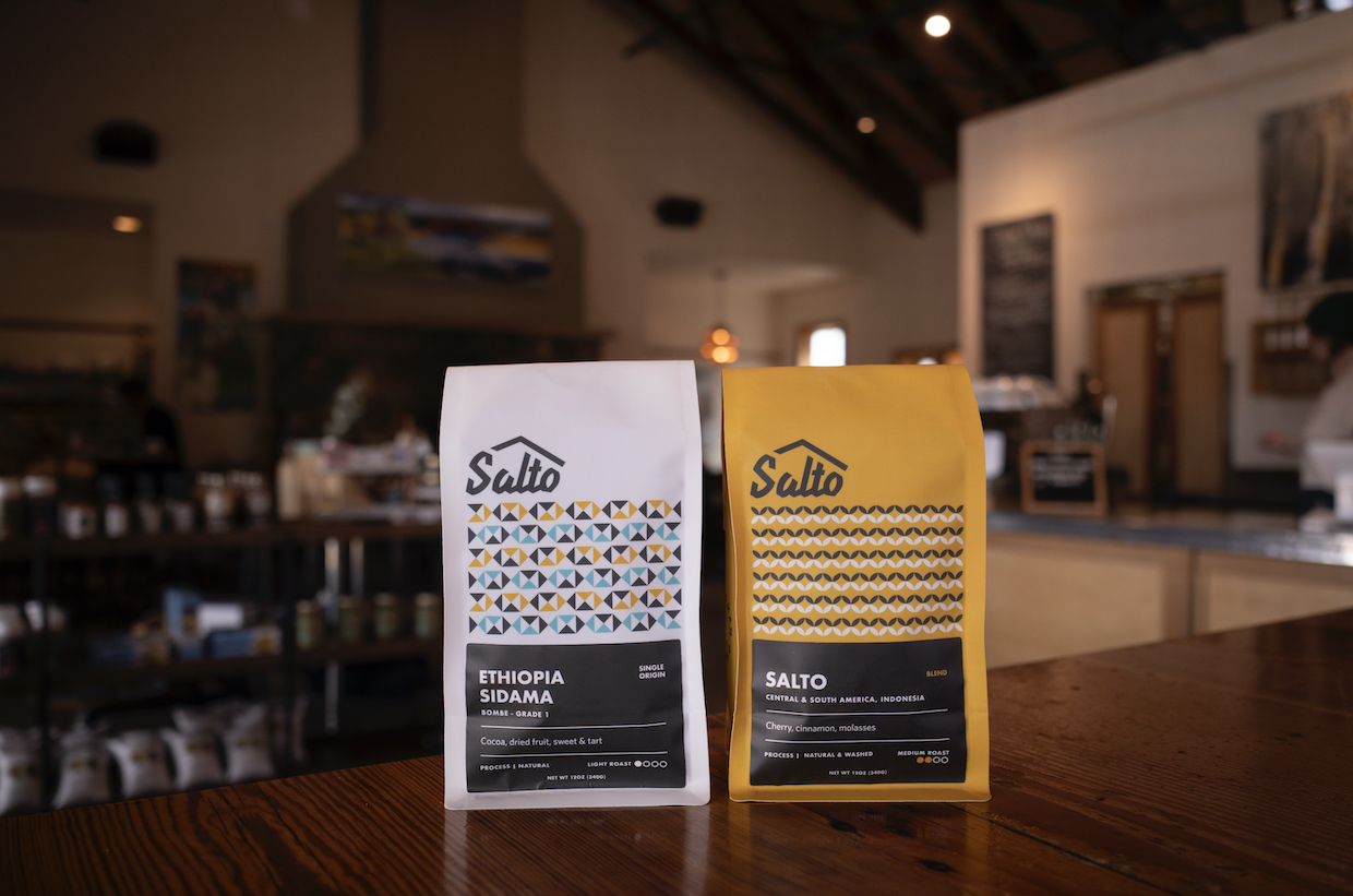
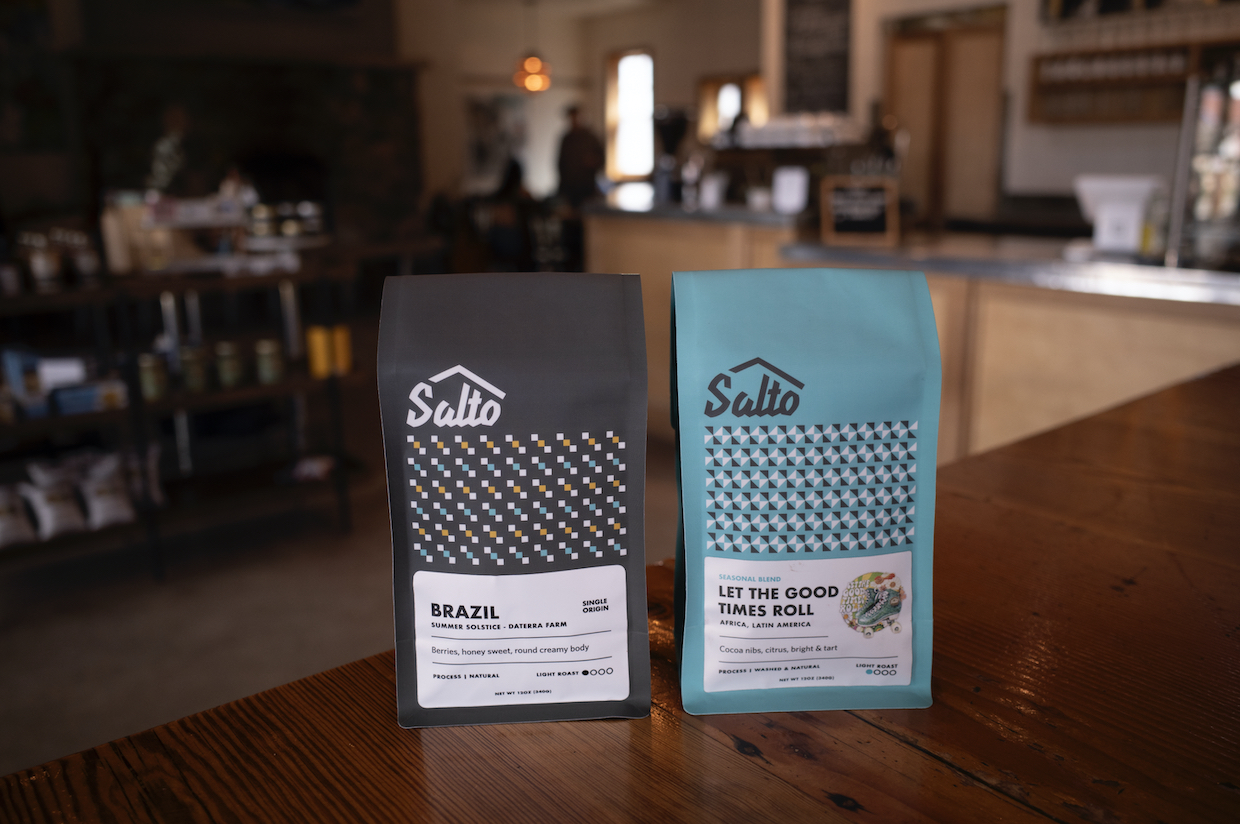
The new Salto Coffee bags at the redesigned cafe in Nederland, Colorado. Photo courtesy of Salto Coffee.
The aspen trees, alpine lakes and granite facades of the mountainous landscapes surrounding Salto‘s lively cafe in Nederland, Colorado, informed a comprehensive rebrand of the coffee company.
Sitting at 8,200 square feet in Boulder County, the company founded by Karina and Marcus Luscher in 2012 has been riding high on the rebrand since the middle of last year.
New bags of roasted Salto coffees have greeted customers with the new logo, color-coding, custom patterns and additional information beyond the previous hot-stamped logo.
For the rebrand — which has also enveloped the cafe — the company worked with designer Daphne Karangianas of Colorado-based Daphne James Studio.
“We created a unique set of patterns that represent the vibrancy, movement and energy at Salto,” Karangianas said in a statement shared with DCN. “Paired with our refreshed color palette that reflects our surrounding mountain town colors of aspen trees, alpine lakes, and granite rock, we chose this design because it best showcases the Salto culture and brand in a distinctive, thoughtful and unexpected way.”

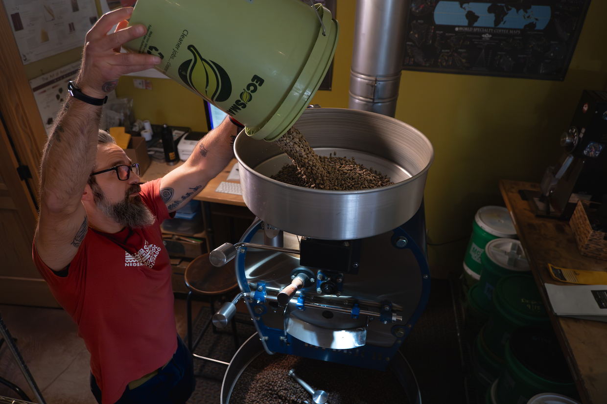
Salto Coffee Head Roaster/Green Buyer Rob Langone at the Salto roastery. Photo by Nick Patrick courtesy of Salto Coffee.
The brand’s new color palette includes: A dark grey “granite peak” for bags of limited/reserve roasts; a “whipped cream” for single-origin roasts; an “alpine aqua” for seasonal roasts and decaf; and a yellowish “aspen glow” applied to signature blends.
Salto worked with MTPack Coffee for the new packaging, using the company’s tall, flat-bottom recyclable bags.


Comment