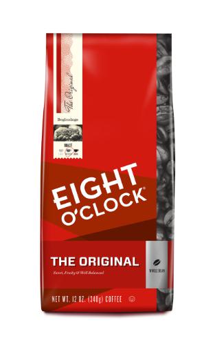
Eight O’Clock Coffee, one of the biggest retail sellers of whole bean coffee in the United States, has unveiled its new packaging, part of a rebranding effort that includes new lines of coffees. The brand, owned by Indian beverage giant Tata Global Beverages since 2006, will also be promoted through a U.S. television advertising campaign and sponsorship deals at fashion shows.
“The Eight O’Clock Coffee brand ‘redress’ is a celebration of our beginnings and a look into the future as we continue to stay relevant in the coffee aisle,” Alisa Jacoby, Eight O’Clock’s marketing director, said in a company announcement. “All of these new brand choices — both inside and out of the bag — were inspired by our consumers who continue to be the most important influence behind our ever-evolving brand.”
The redesigned is being accompanied by the release of four new blends, under the names African Plains, Caramel Macchiato, Dark Chocolate Cherry (seasonal), and Cinnamon Bun (seasonal). The company is also introducing a Rainforest Alliance-certified arabica blend from Central America known as Central Highlands. In the announcement, the Eight O’Clock said the certified coffee will offer consumers a “new twist.”
Nick Brown
Nick Brown is the editor of Daily Coffee News by Roast Magazine.
Comment
2 Comments
Comments are closed.


This might be an okay design on its own; but considering the company’s history it feels more like salt in a wound.
As both a designer and loyal drinker of Eight O’Clock’s Colombian (now “Colombian Peaks” –ugh) this design is a horror on the shelves.
Color-wise, it now looks much like many other brands, but even worse is trying to determine the varieties and grind within the brand.
The photo of the beans is now a standardized black and white picture, a dull contrast to the bright field of red. Very unappetizing.
The bean variety/ flavor/ roast (i.e. Original, Colombian, Hazelnut, French Roast) is in a small flag near the bottom, completely covered by most larger supermarket’s spring-loaded displays that keep product at the front of the shelf. The color of the flag is the only discernible variant; and its tiny.
Then… the whole bean vs ground designation is a microscopic pictogram and tiny type which is very difficult to read; especially on the reflective metallic package material. One could easily pick up the wrong version.
Considering that many of their customers are older folks with declining vision, this is hardly a welcome change.
The upper field of the package is completely wasted, in that the consumer’s eye starts from there, and quickly loses interest if they can’t get the information needed.
Lastly, and this is me being grumpy, is the unneeded frou-frou of the new names. Colombian Peaks?! All I need to know is that its the same old Colombian I’ve always used. Every name seems to be similarly tarted-up to further obscure what you’re buying.
Again, on its own, this is a decent-looking design. But it is a catastrophic failure in the sea of other brands and in comparing their own varieties against one another.
So many errors is puzzling.
This is a brilliant analysis of the failings of the redesign. The addition of the word “Peaks” was undoubtedly done because of the subliminal connotations of that word. (Think of the movie title *Twin Peaks* if you need a hint about the unconscious significance of the sound.)