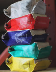
With package redesigns, the consumer sees one thing, then they see a newer, better thing. Of course, the process is not so clear-cut for designers, roasters, production staff and marketers — those people whose daily lives are affected by the minutiae. That’s why I was struck by this paragraph in a promotional email from Burlington, Ontario’s Detour Coffee Roasters, which recently began shipping redesigned 12-ounce bags:
It’s been an amazing process, long and often frustrating when we were often told that we couldn’t do what we wanted. We politely said we wanted to anyway and in the end we got our way on almost everything. It caused delays, it kept us up at night and it stressed our production team out constantly. But we’re glad we pushed forward because we’re so, so happy with the end result.
The result is a new one-way-valve bag that gives each coffee a unique color and individual sticker label design, provides more information about the coffees and the roastery, and generally presents a more dramatic and appealing look on the shelf, while maintaining the prominent display of the Detour logo. As it turns out, the bag redesign was actually an 18-month process, involving the Detour production the small husband-and-wife team Studio Ours.
(related: A Look at Some of the Best Coffee Packaging Designs of 2014)
“It was a very long process but that wasn’t all due to the project,” Detour’s lead roaster and green buyer Geoff Woodley tells Daily Coffee News. “We have some very talented friends that live up the street from our cafe and approached them about the idea. We knew their work and how much experience they had and we always feel that working with our direct community is valuable.”
So why did Detour make the change? Woodley says the primary reason was that it was shipping more coffee to consumers throughout other parts of Canada, the United States and overseas and the previous simple paper bags with label slips for each coffee were creating some quality concerns.
(related: 1000 Faces, Ken Kesey’s Psychedelic Hay and Packaging Varietals Side by Side)
“Although paper worked for the roastery initally, when 90 percent of our business was local, we had started shipping more and more coffee out and we obviously felt a sealed bag would present our product better abroad,” Woodley says. “We had also been running with the same design for almost 4 years and knew an update in branding was needed.”
Nick Brown
Nick Brown is the editor of Daily Coffee News by Roast Magazine.


Comment