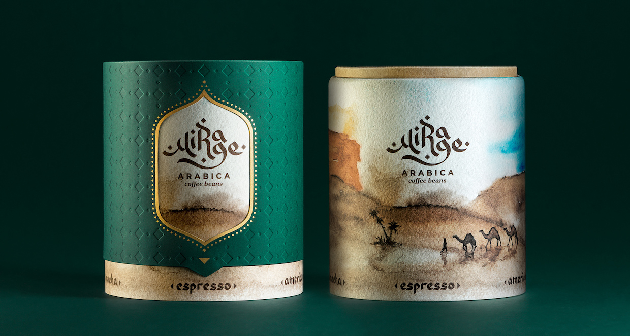
In what was purely a design exercise, a small group of Armenians has created a highly creative new kind of coffee packaging, with a drinks-inspired color palette giving life to a mirage theme and the name Mirage Arabica.
There’s something non-coffee-ish about this particular design that makes it especially refreshing. While it doesn’t point directly to origin, or to the name of the coffee, it does instead take inspiration from the coffee’s end result — the finished drink — with a strong focus on the artwork itself.
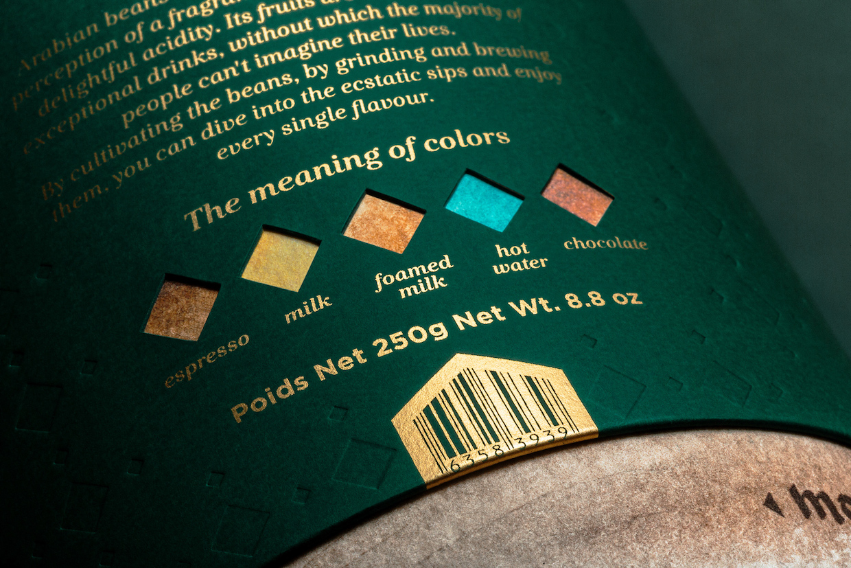
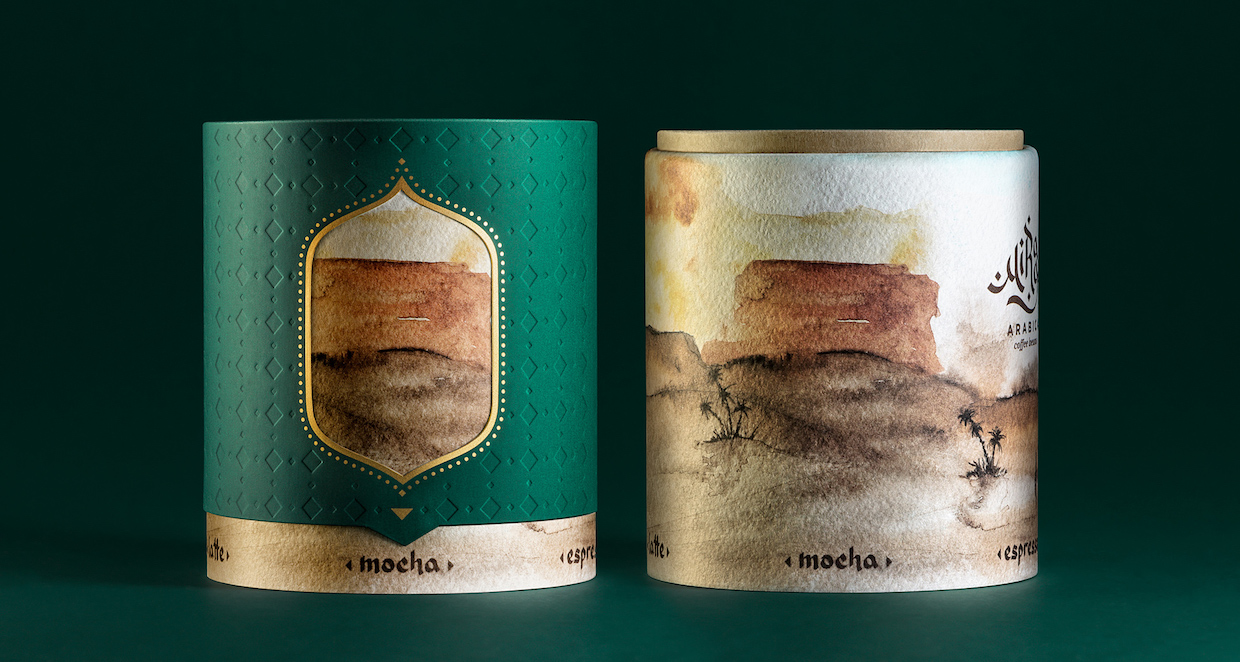
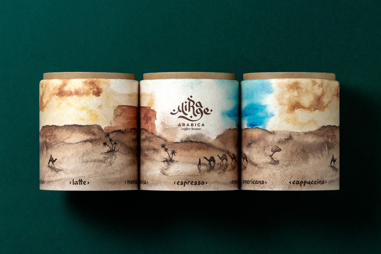
The colors used are reflective of common espresso drink ingredients — espresso, cold milk, foamed milk, hot water and chocolate — and five different drink types are aligned with an Arabian desert image. As users rotate the outer layer of the packaging to align it with the different drink types, images appear and disappear, like a mirage.
Granted, it may not tell you anything about the coffee inside, but after seeing so many bags — often lovely in their own right — that lead consumers down the same path (origin name, three tasting notes, brand or coffee color association), there’s a finely executed consumer-focused whimsy here that’s much appreciated.
For more info on the designers, check out their project page on Behance.
Nick Brown
Nick Brown is the editor of Daily Coffee News by Roast Magazine.


Comment