Though the Specialty Coffee Expo has come to a close, it has opened eyes afresh to the world of coffee packaging design, as style-conscious roasters from throughout the world shared branded bags with their peers.
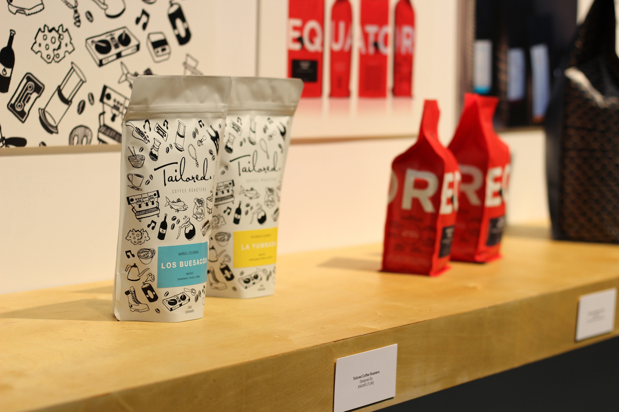
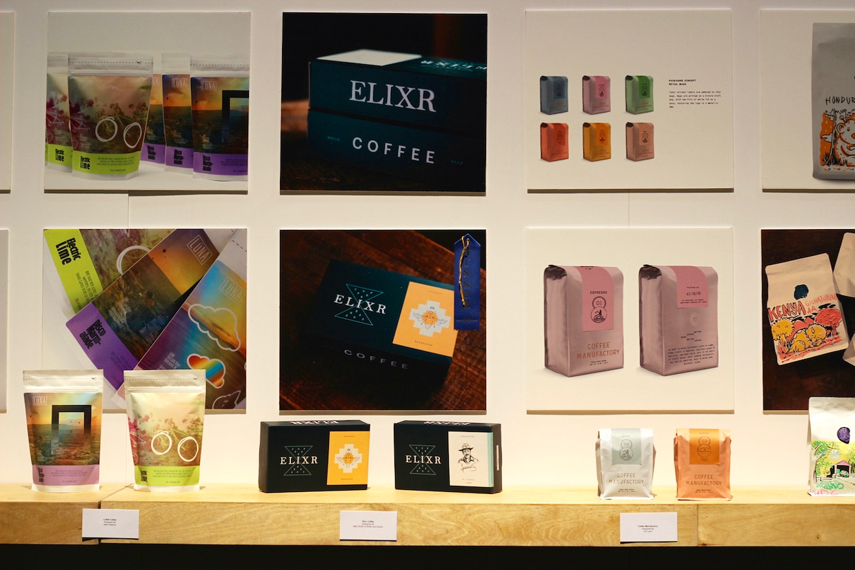
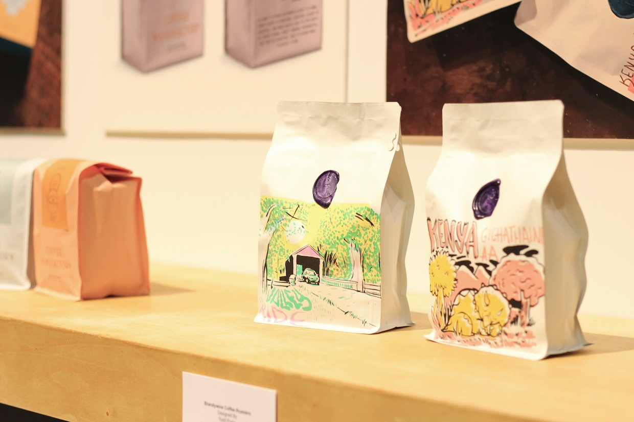
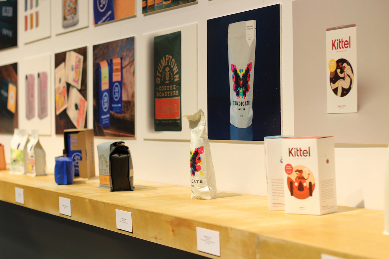
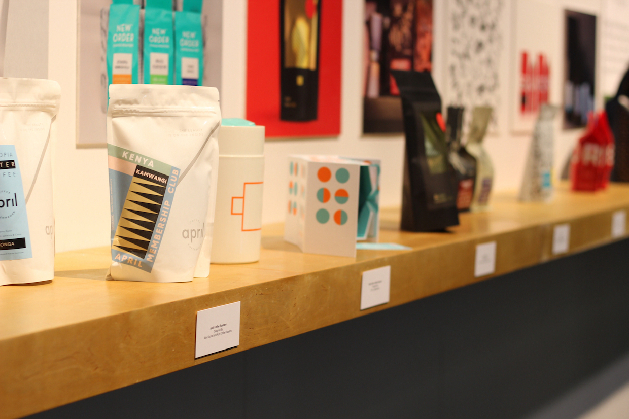
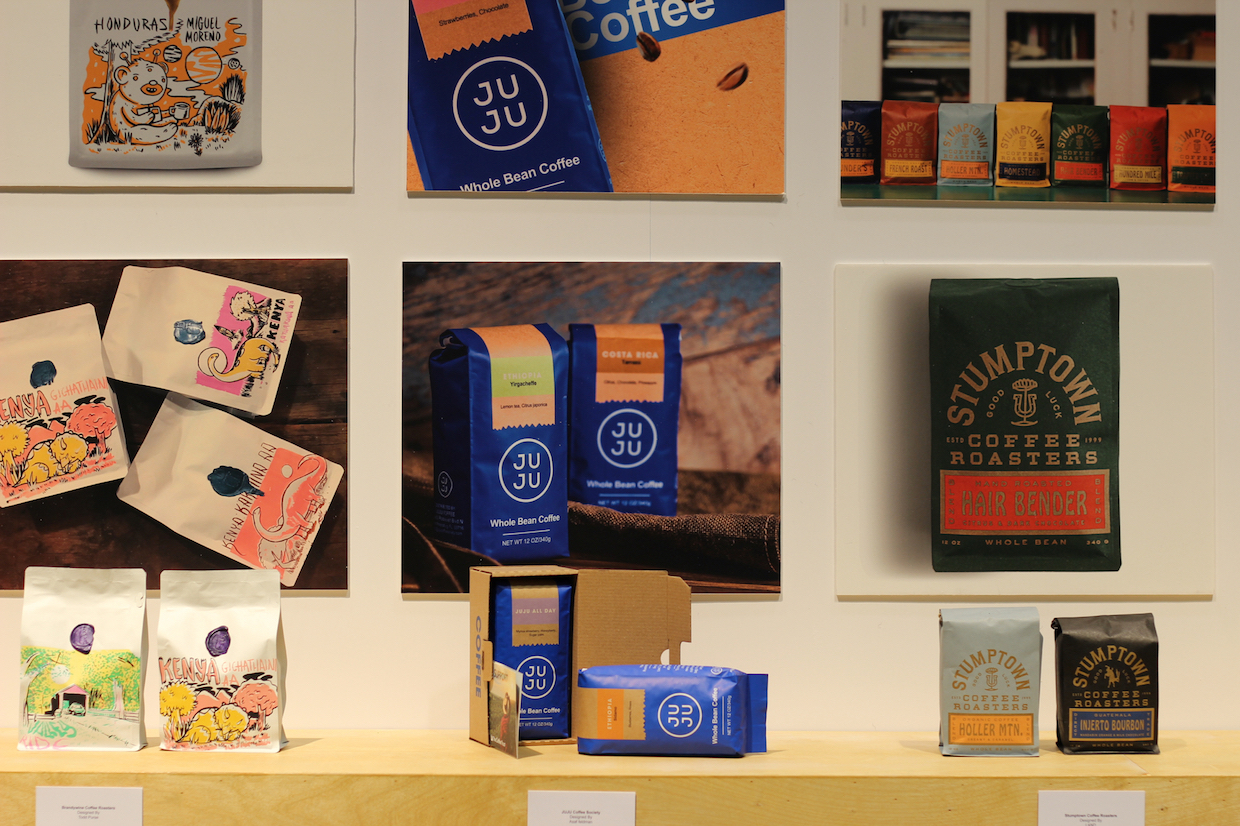
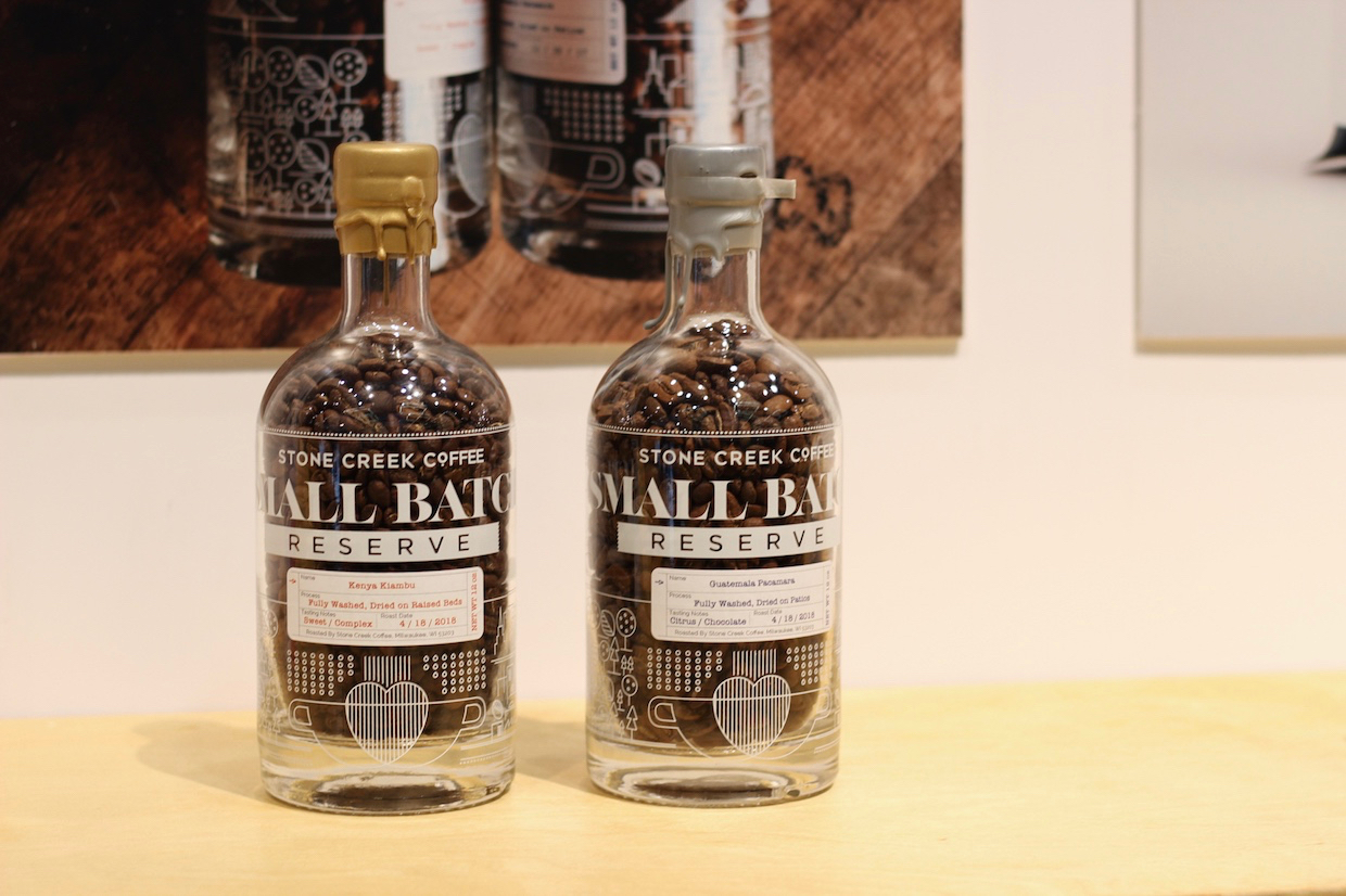
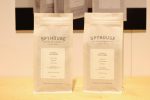
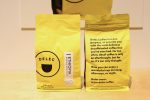
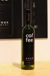
On display in the Specialty Coffee Association (SCA) Design Lab exhibit — which also included showcases for “spaces” and for “vessels” — were bags, boxes and bottles of all kinds, along with the hundreds of other bags circulating like boutique contraband throughout the Washington State Convention Center.
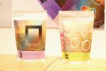
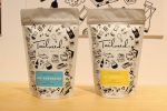
In this veritable forest of creative coffee packages, one company came away with a win for the Design Lab’s packaging award: Philadelphia-based Elixir Coffee. Working with local designer Mike Smith of Smith and Diction, Elixir took inspiration from the hourglass-like shape of Chemex brewers.
In addition to reflecting their core values of innovation, simplicity, integrity, and ingenuity, the goal with this design was “to move to a completely recyclable package, along with offering a simple, always neat, never wrinkled look,” according to a winners announcement from the SCA.
We met with Unpacking Coffee hosts Kandace and Ray of the Portland, Oregon-based design agency Needmore Designs to chat about some of the trends and innovations they are seeing in coffee packaging design this year.
“It seems to me like the trends have been pretty consistently moving away from the textured craft thing to real minimalist color and space, to make coffee appear less ‘commodity,’ more ‘high-end’ — real simple, minimal, and an attempt towards an illustration style,” said Ray.
Added Kandace, “The illustrations lately have been pretty phenomenal.”
“Right. They’re thinking more about how the product is presented, like how Equator had spelled our their name on the four sides of the bag,” said Ray. “I feel like in the past, you’d just look at the bag itself as an item, and now you’re thinking about how its going to be presented on a shelf and how it can tell a story.”
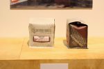
He added, “People really like to use those block bottoms so the bag sits flat. In packaging design in general, people have been tending towards things that sit on their own — and different bag shapes. I’ve noticed people trying out square bags instead of rectangular. Which looks cool, it reminds of a vinyl record.”
Kandace and Ray agreed that secret messages or elements in the packaging that may be discovered upon opening can provide an easy and delightfully surprising way to connect more deeply to individual coffee drinkers. Said Ray, “It’s like an ear worm of the mind.”
Kandace noted a potentially emerging strategy in which coffee roasters may be less interested in promoting themselves, and more interested in how their packages fit in with a drinker’s own visual tastes. She said as consumers are bombarded with more attractive options on grocery shelves, a more important consideration might be how the bags look at home.
“With a lot of bags with the beautiful illustrations, the design really speaks to the roaster, and the label is speaking to the specific coffee producer, and then marrying those,” added Kandace. “[But] people are thinking a lot more about what a bag looks like on a kitchen shelf.”
Another general trend that they observed is a reduction in the amount of copy on the bag, while providing more extensive information on specific coffees or blends online.
“It is hard to design around a large amount of text,” said Ray. “You don’t want your bag to look like a newspaper.”
Kandace said many consumers are also starting to pay more attention to the environmental impacts of coffee packaging. As a result, many roasters are moving away from products that have two layers of packaging or that are not recyclable.
Interestingly in the case of Elixr, sustainability was one of the distinguishing factors in the product’s win, with the box and the inner bag being fully recyclable.
Lily Kubota
Lily Kubota is the managing editor and digital content manager for Roast Magazine. She is based in Southern California.
Comment
1 Comment
Comments are closed.








Those are some really beautiful designs. Love it!