DCN’s ongoing “Design Details” series highlights specific details in coffee shop/roastery interior design or coffee-related packaging and branding. Share your project for consideration here.
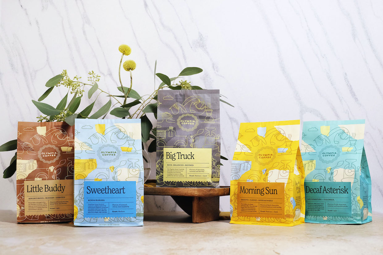
Late last year, Washington state-based Olympia Coffee rolled out new bags designed both to attract the eye and reduce waste.
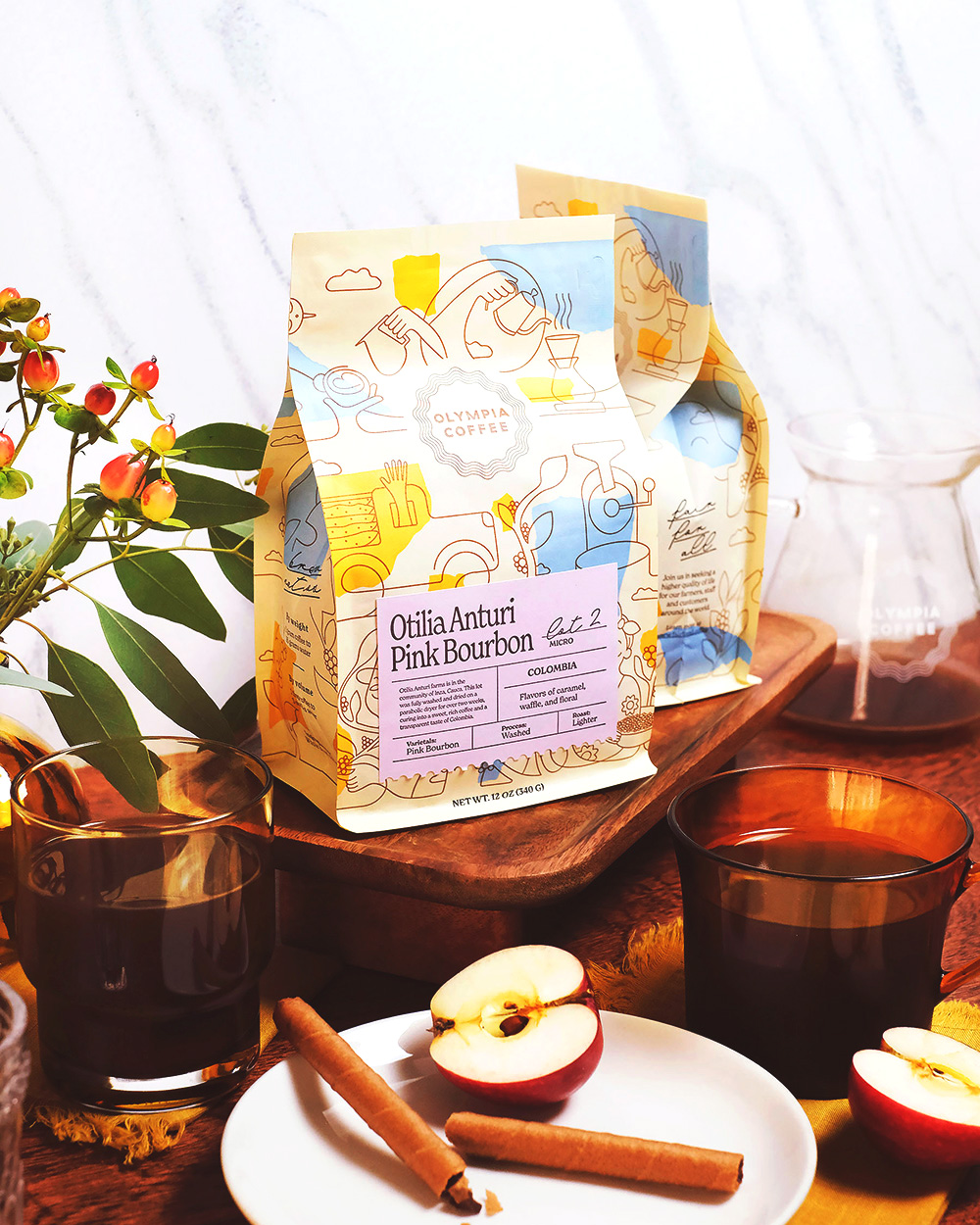
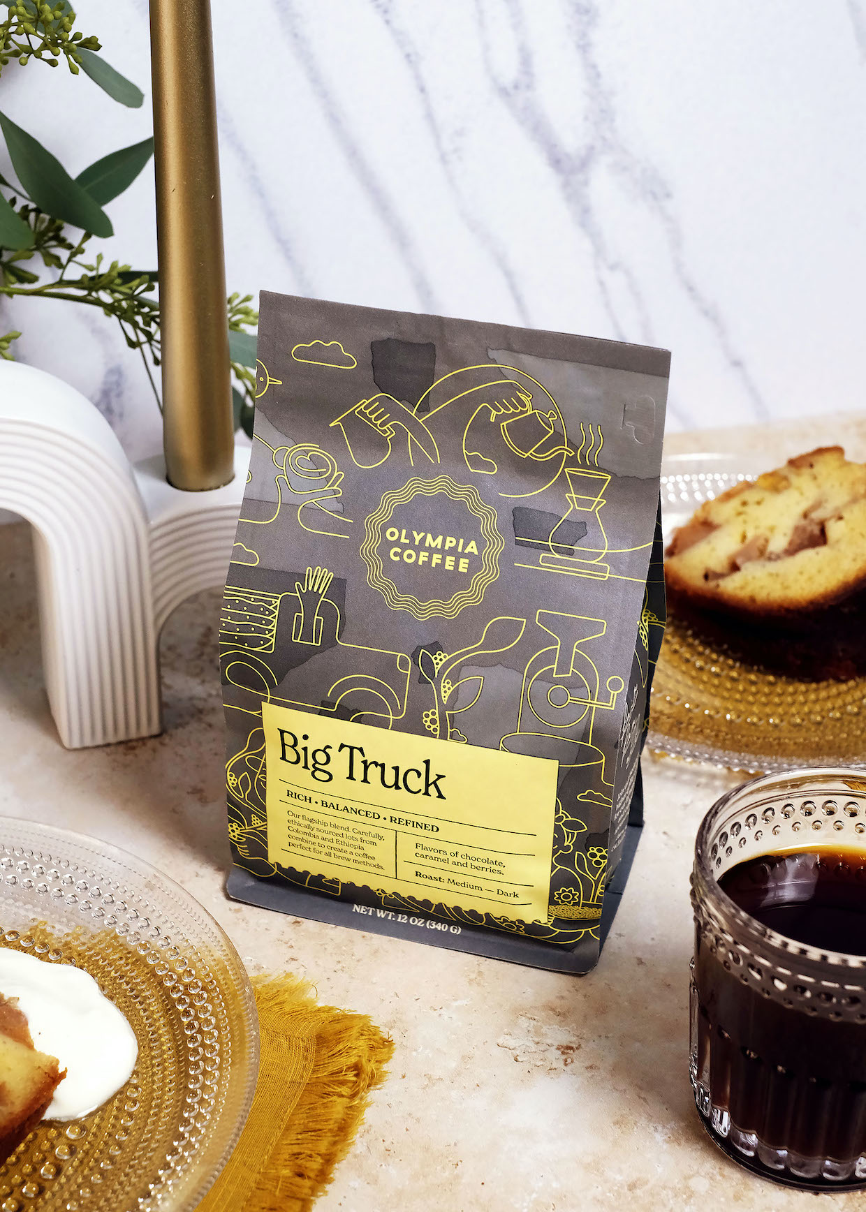
Created with the help of the Bogotá, Colombia-based design firm S&Co., the new bags feature a custom wraparound illustration from Italy-based artist Jonathan Calugi. The illustration depicts the seed-to-cup coffee journey.
While the seed-to-cup trope has been widely used in the coffee industry, it represents something more substantial for Olympia, which has historically prized long-term relationships with producers, as well as concepts such as supply chain transparency and equity.
Behind the illustration are bold new colorways for Olympia, signifying blends and core offerings, as well as single-origin and limited offerings.
Notably, the new packaging consolidates what was previously two labels’ worth of information into a single front label, streamlining production and reducing paper waste.
The packaging involves the plant-based and compostable Biotrē line of bags from packaging manufacturer TricorBraun Flex.
“Along with improved storytelling opportunities, streamlined production, and reduced paper waste, the refresh also infuses a burst of vitality and character into the visual scheme for this growing brand, which had not seen a redesign in five years,” Olympia said in an announcement of the redesign shared with DCN.
A recently re-certified B-Corporation, Olympia Coffee currently operates six cafes — including its headquarters in downtown, Olympia, Washington — as well as Moonrise Bakery in Seattle.
Comments? Questions? News to share? Reach DCN’s editors here.


Comment