


Welcome to Design Details, an ongoing editorial feature in Daily Coffee News focused on individual examples of coffee shop architecture, interior design, packaging design or branding. If you are a coffee shop owner, designer or architect and would like to submit your project for consideration, reach our editors here.

The new Cravens Coffee bags. All images courtesy of Sally Morrow Creative.
While “storytelling” on coffee bags can often drift into deep abstraction, new package designs for the long-running Cravens Coffee brand in Spokane, Washington, remain deeply grounded in the coffee.
Part of a complete brand identity refresh developed with creative firm Sally Morrow Creative (SMC), the new packaging was designed to carry on the quality-focused legacy Cravens has built in Spokane since 1993 while modernizing the look from every angle.

“Cravens has an incredible story — one grounded in relationships and high quality,” Sally Morrow, creative director and principal at SMC, said in a project description shared with DCN. “Our job was to elevate those strengths through design that tells their story in a modern, visually engaging way.”
The new Cravens bags lean heavily on tone-on-tone illustration, using a warm, muted palette. A subtle pattern wraps the package in repeating figures and botanical forms, coffee leaves and fruit, coffee picking and other cues tied to origin, agriculture and farm work.
According to the design description shared with DCN, SMC developed custom illustrations to “highlight the farmers, plants and environments where Cravens’ beans are grown,” reinforcing the roasting company’s emphasis on long-term sourcing relationships with coffee producers.
Further reinforcing those concepts are short callouts on the bags that read “Quality takes work. It sure is worth it.” and “Respect the farmer. Reveal the flavor. Reward the drinker.”
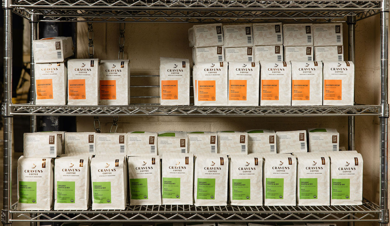
On shelves, the packaging relies on crisp, rectangular color blocks that sit on a light field, establishing a strong “billboard” effect to distinguish blends, single-origin offerings and seasonal releases.
Cravens and SMC extended the redesign beyond the bag and into the physical retail environment. Within a redesigned grocery kiosk, the brand’s copper-toned header panel anchors the display with the new Cravens logo. A modular fixture supports multiple buying formats, including bulk bins with color-coded product labels, rows of bagged coffee below, plus integrated equipment and storage.

“Every element was designed to tell a story,” said Morrow. “From farmer to roaster to customer, we wanted the brand to reflect the people and relationships behind every bag.”
Comments? Questions? News to share? Contact DCN’s editors here. For all the latest coffee industry news, subscribe to the DCN newsletter.
Related Posts



Comment