

Coffee shops — especially independent, upscale ones — have long been markers of gentrification within given neighborhoods.
Along with a handful of academic studies that have explored the relationship between coffee shops and any number of other metrics of change such as increased rent or decreased crime, there are countless anecdotal reports that suggest coffee, particularly relatively pricey coffee in boutiquey environs, is gentrification’s bell cow.
It is clearly a chicken/egg scenario, and any formal study on the correlation between coffee shops and gentrification seems inherently limited. Additionally, gentrification is itself a divisive and paradoxical phenomena, where on one side there is an argument for positive economic growth to benefit residents of individual neighborhoods and entire tax bases, while on the other side are very real losses of social diversity, increased and unsustainable real estate and rent prices for existing business owners, and the displacement of existing residents.
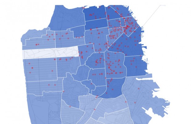
Inspired by the Anti-Eviction Mapping Project — a social project designed to inspire people to fight back against those who profit from developments that displace others — a Github user has created a fascinating map that attempts to explore the correlation between the number of coffee shops and gentrification, as expressed through apartment rental prices, in San Francisco over the past five years.
The map’s creator writes:
Here’s the thing: if you really want an idea of how high the rent in a given area is, count the yoga studios. Count the vintage clothing shops, the art galleries, the restaurants that use mason jars in place of glasses, the man-bun-sporting white millenials, the Trader Joes and Whole Foods. And, of course, the coffee shops, replete with cheeky names on chalkboard menus and $5 mint-infused mochas. It’s a curious correlation: why is cold brew such an overt symbol of second-wave gentrification? And what, exactly, powers the phenomenon — do the yuppies drive rent up, or is it the swathes of trendy coffee shops that follow? Or maybe precede? Where does the displacement begin?
I don’t have the answers to these questions, but I wanted to gather and visualize the data that might provide some insight.
See the full, interactive map here, where each red dot represents a coffee shop and links to its Yelp page, and where increased rent is represented through darkening of the blue shade.
Nick Brown
Nick Brown is the editor of Daily Coffee News by Roast Magazine.


Comment
1 Comment
Comments are closed.

Gentrification is not a simple this-causes-that kind of thing. Its dozens of feedback loops that slowly all begin to align. Where I live it was an old residential area that was right in the middle of the city – convenient to many major employers, medical facilities, etc. It makes sense that professionals that work in that area would be attracted to the ability to live nearby. Yes, eventually a coffee shop appeared, but it was part of a much bigger swing of events.