

With a roastery, two brick-and-mortar cafes and a permanent place inside the downtown Mother’s Farmers Market, Transcend Coffee already had a strong presence in Edmonton, Alberta. The visual presence of its bagged coffee, however, was lackluster:
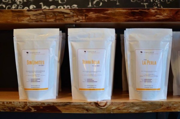
Transcend Coffee old packaging
After working with local designer Joel Verhagen, Transcend earlier this summer launched a new package design, one the company hopes better reflects its own vibrancy and spirit, as well of that of the coffee within.
(related: Package Design Case Study: Detour Coffee Roasters of Burlington, Ontario)
“During the process of setting key values, the company decided it was time for a brand evolution,” Verhagen recently told Daily Coffee News. Let’s get right to the end result, shall we:
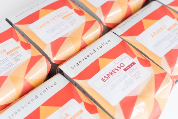
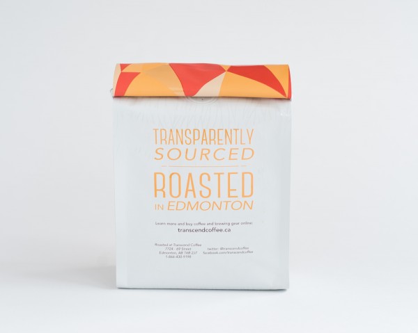
Transcend Coffee new packaging
Here’s more from Verhagan on how he approached the challenge of coffee bag design, beginning with how the bag would appear on shelves among those of competitors:
A bright, colorful bag would be best as they would be expanding to more wholesale clients and grocery stores, where it would need to stand out among other products. Since Transcend has always been a bold company, never afraid to take risks, I chose a bright colur scheme of orange and red. Gloss was used on random triangles to help catch people’s attention as they walk by the package on the shelf and give it a high-end feel.
Of course, there are some functional concerns with individual bags, as well. Says Verhagen:
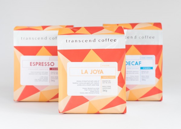
A previous issue with Transcend’s coffee bags was that they wouldn’t stand on their own, so we chose a shorter, wider bag shape with a triangular cut bottom to assist with coffee staying on the shelf.
Using Soto and Mission Gothic typography, the bags display a hierarchy of information, emphasizing first the type of coffee within — espresso, decaf or filter — and, when applicable, identifying origin. Roast date and tasting notes are presented prominently on the front, conveying an immediate sense of quality and distinction.
(related: Branding Case Study: Steampunk To-Go and Mood-Reflecting Cups at Gawatt)
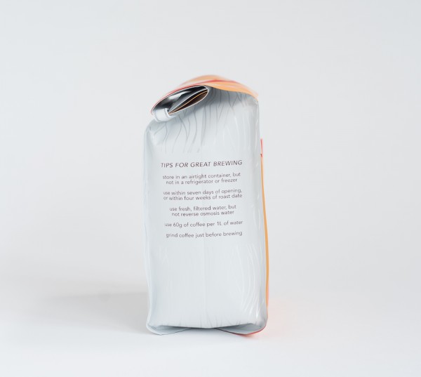
One side of the bag includes some basic advice on brewing tips, including how to store the coffee, when to brew the coffee to maintain freshness, what water to use, etc., while a company message on the back of the bag provided the biggest challenge. Says Verhagen:
After much debate on what that meant, we chose a simple message that quickly explains the two things that sets Transcend apart: ‘Transparently Sourced, Roasted in Edmonton.’ The back also features a clear gloss pattern to give texture when customers hold the bag and to attract attention to that very important message.
Nick Brown
Nick Brown is the editor of Daily Coffee News by Roast Magazine.
Comment