

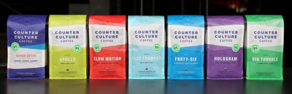
After nearly 20 years in business, Durham, N.C.-based Counter Culture Coffee is unveiling bright new new packaging for its 12-ounce retail bags, beginning Oct. 3.
Gone is the old Counter Culture hand-drawn coffee tree logo, which has been replaced on the new packaging by vibrant colors, bold sans serif fonts and subtle of waves of lines to convey texture and distinguish coffees under the CCC umbrella. In an announcement today, Counter Culture President Brett Smith says the bags, designed in-house, are designed to “better communicate the core values that have guided Counter Culture for almost 20 years, while presenting a more contemporary and cohesive look.”
(related: Package Design Case Study: Detour Coffee Roasters of Burlington, Ontario)
In addition to the look of the bags, CCC is changing the names of its year-round blended coffees. Here’s more on the name changes, straight from the source:
- Toscano becomes Big Trouble – Big Trouble, now outfitted in a bold green bag with an undulating icon, offers nutty, caramel flavors which may seem easy to bring out, but it’s actually one of the most challenging for Counter Culture to source—hence the name—because clean, sweet, low-acidity coffees from small-scale farms can be hard to find.
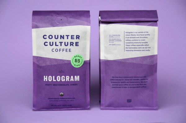
- Rustico becomes Hologram – Hologram, now outfitted in a violet package with a geometric half-burst pattern, is in many ways an updated Mocha Java flavor profile. Fruit-forward and chocolatey flavors in this coffee combine to create something distinctly complex. These coffees especially reflect the tremendous work put into improving dimension and clarity.
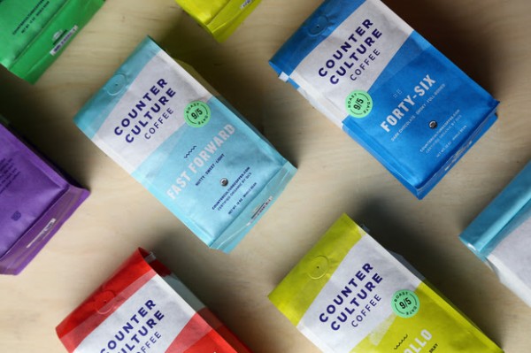
- Farmhouse becomes Fast Forward – Fast Forward, now in a clean light blue bag with a zig-zag icon to distinguish it, combines similar coffees from different harvest periods, which makes for easier enjoyment of fresh coffees throughout the year. Bonus: Fast Forward allows Counter Culture to work with emerging coffee projects.
- Decaf Farmhouse becomes Slow Motion [decaf] – For Slow Motion, now in a red package with a zig-zag opposite of Fast Forward’s icon, Counter Culture starts with the same high-quality coffee used for any other year-round offering and decaffeinates it in small batches via chemical-free water processing.
- The smoky, full-bodied Number 46 coffee simplifies to Forty-Six and is outfitted in a teal blue bag, and the beloved bright Ethiopian coffee-inspired Apollo will keep its name, and will be in a fitting bright yellow package.
CCC’s single-origin coffees will each have their own labeling and colors, while CCC says those coffees — representing dozens of countries and farms — will have a “unique texture and icon that is representative of that coffee.”
(related: A Look at Some of the Best Coffee Packaging Designs of 2014)
An element often understated on roasted coffee packaging, if it is present at all, the roast date is being prominently displayed on the new CCC bags with a round Spring green-color sticker on the front. The package material is composed of 60 percent biodegradable material and 40 percent polyethylene plastic that bag-maker Pacific Bag developed under the name Biotre. The 40 percent PE volume of the bag is treated with an additive that allows it to break down over five to 10 years, reducing waste over time compared to traditional PE.
Nick Brown
Nick Brown is the editor of Daily Coffee News by Roast Magazine.

Comment
3 Comments
Comments are closed.
Not sure how I feel about this………..Tinky Winky, Dipsy, Laalaa,Sun Baby? Might as well be the Power Ranger!!!! No bueno!
I think this is a great direction!! A much needed change!
My reply to the e-mail was: “Is this a joke?” We subscribe to them for two bags every two weeks. Love the coffee and company but from Toscano to Big Trouble??? Describes their experience with sourcing the coffee and tells nothing about the flavor profile or roasting of the coffee. I do not think I would buy the new named and bagged coffee based on the name and packaging if I had not already tasted it.