

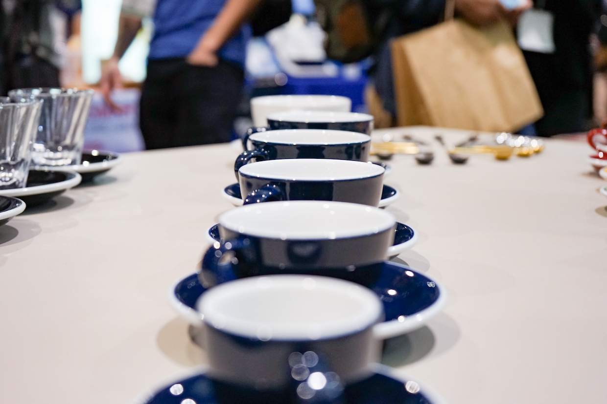
Loveramics coffee mugs. Daily Coffee News file photo by Howard Bryman.
Several new scientific studies explore how color, texture and shape of the cup affect drinkers’ perceptions of coffee.
In three separate studies published recently in the scientific journal Food Quality and Preference, Fabiana Carvalho of the Department of Philosophy at the University of Sao Paulo, Brazil, and Charles Spence from the University of Oxford, UK, explored how the shape, the color and the texture, respectively, all have significant effects on how a drinker perceives various attributes of coffee before drinking, during drinking and after drinking.
The cup shape study, published in Sept. 2018, involved 276 participants in attendance at a specialty coffee event in Brazil and included both professionals and untrained consumers.
Participants were served coffees in tulip-shaped cups, conventional cups that open more widely at the top, and cups that were split with a bulbous bottom half and open top. Amateurs and experts both found the aroma more intense in the tulip cup, and sweetness and acidity to be intensified by the split cup. Consumers gave the split cup low ratings for likability, whereas the experts rated it more highly.
“Taken together, these results demonstrate for the first time that the shape of the cup significantly affects the perception of the sensory attributes of specialty coffee, for both amateur and expert consumers,” the authors wrote.
Cup color was the focus of a study published in July of last year. That study consisted of serving either a classic sweet Brazilian coffee or an acidic Kenyan coffee to 457 consumers in either pink, yellow, green and white ceramic cups.
“Participants first rated their expectations of sweetness and acidity, and subsequently, their experience of those attributes on tasting the coffees, as well as rating their liking,” researchers wrote in the report. “The results revealed that the colour of the cup exerted a significant influence on both pre- and post-tasting ratings for all attributes measured. Liking ratings significantly decreased in incongruent pairing conditions — which also increased the unexpected acidity of the Kenyan coffee when tasted from the pink cup. Taken together, these results demonstrate for the first time that the colour of the cup significantly impacts sensory and hedonic judgements of specialty coffee.”
Coming in the April 2020 issue of Food Quality and Preference is the texture study, for which a total 231 participants were involved in one of the three tests.
A preliminary test conducted at a specialty coffee event in Russia indicated that the perception of coffee body and aftertaste changed when the drinker rubbed a swatch of sandpaper while drinking. In the two main studies, one for consumers and one for professionals, different samples of specialty coffee were served in either a smooth or a rough ceramic cup.
Certified Q-graders perceived coffee as more acidic when they drank it from a rough cup. Consumers perceived coffee as sweeter when they drank it from a smooth cup. Both groups interpreted the aftertaste as “dry” when they drank either coffee from a rough cup.
“These results demonstrate that haptic cues influence the judgment of basic tastes as well as mouthfeel attributes in specialty coffee, for both experts and amateur consumers,” the researchers wrote. “Such results should be considered by the industry when designing innovative coatings for coffee cups. In addition to innovation, though, it is important to create cups that convey some functional and/or perceptual benefit for the coffee drinking experience.”
To this point, manufacturers have put more thought into traditional serving sizes than to the multi-sensory experiences promoted or hindered by the cups they design, according to Carvalho and Spence.
In an analytical review of the combined findings of these three studies published in July of 2019, Carvalho and Spence took note of some exceptional new coffee vessels that have entered the market in recent years — specifically the Oslo set by Tim Wendelboe and Figgjo, the Loveramics Brewers line of tasting cups, and the Kruve EQ line of glassware — but note that while all of them emphasize shape as the driver of new levels of multisensory appreciation, they could have taken better advantage of color and texture, as well.
“This would seem like a lost opportunity given that the latest research has shown that all aspects of the receptacle (including its colour, weight, size, texture, and shape), can potentially exert a significant influence over the tasting experience,” the researchers wrote. “Furthermore, such results have been demonstrated in both social drinkers and coffee experts. By now, they have also been demonstrated for a range of coffees and preparation methods. And while the world of wine glassware seems relatively narrow in terms of the kinds of drinking receptacles that the consumer will accept, coffee feels like it may be far less constrained in this regard.”
Howard Bryman
Howard Bryman is the associate editor of Daily Coffee News by Roast Magazine. He is based in Portland, Oregon.


Comment
1 Comment
Comments are closed.

Shape? Of course. Anyone with much exposure to the world of ethanol will be aware of this. Brandy snifters, champaigne flutes, various shapes for the “bowl” of wine stemware for different types of wine, distinctive ware for different sipping liqueurs, are most often developed to bring forward certain sensory qualities of the wine, port, sherry, cognac.
Colour, I get that one, too, as we are all susceptible to changes in perception due to what our eyes see.
But texture? Now THAT one surprises me I’d want to see more experimenting with that one. before replacing all my smallwares……